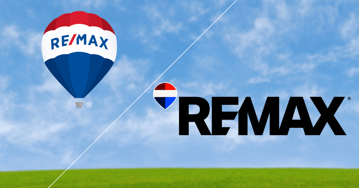


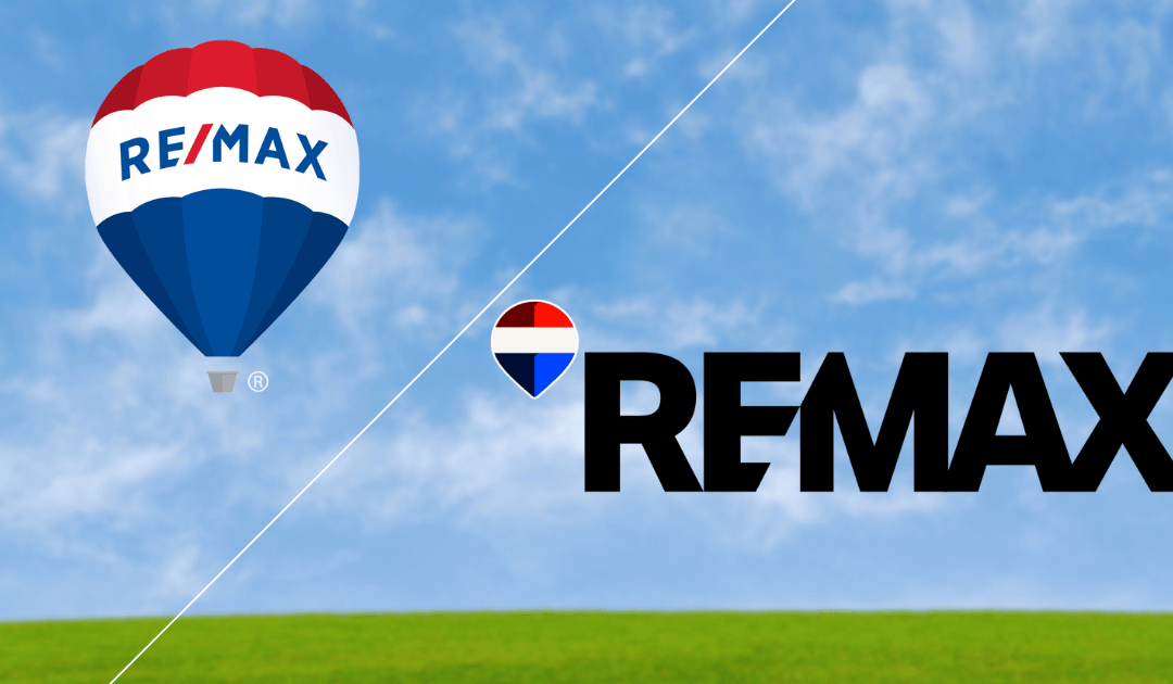
Out with the old and in with the new; Re/Max recently debuts new digital-first logo (right)
It has been a rollercoaster start to the year for Re/Max as the company moves past legal distractions and mixed financial results to reposition itself for the future.
Over the span of one week in February 2025, Re/Max announced a settlement in an ongoing lawsuit, launched a digital rebrand and disclosed its 2024 earnings, which included decreased revenue and an overall decline in North American agent count.
These developments followed news that President Christopher Alexander would step down from his role effective Mar 3. Alexander will remain in a consulting role through Jun. 30.
“Under the leadership in place…and the rest of the team, we have done a great job with our region being as much on the cutting edge as possible,” said Braden Wheatcroft, broker/owner of Re/Max Camosun in Victoria, B.C. “When you read the stats, it’s just empirically true; the home buying and home selling population look at Re/Max agents in a really nice light.”
Legal challenges and financial turbulence
However, the company’s image may have shifted recently. In a move that surprised many industry players, Re/Max settled two class-action lawsuits concerning commission structures for $5.5-million USD ($7.8-million CAD). Despite the settlement, Re/Max strongly denies any wrongdoing.
This announcement came on the heels of a challenging financial year. In 2024, Re/Max reported a 5.5 per cent revenue drop to $307.7-million. According to its earnings report, the combined agent count in Canada and the U.S. fell by roughly 5% to under 76,000. Notably, all agent losses were in the United States, while Canada experienced an incremental gain of three agents.
The report did offer positive signs, including slightly improved profitability and stable operating efficiency.
Rebranding for a digital-first future
Amid leadership changes, legal settlements and mixed financial performance, Re/Max’s announcement of a digital rebrand appears strategically timed.
The company introduced a refreshed logo and simplified typeface, modernizing the iconic balloon graphic and condensing its logotype. This marked the second rebrand within the last decade, following an update in 2017. It is only the third time the typeface has changed and the fourth iteration of the famous Re/Max balloon since its debut in 1978.
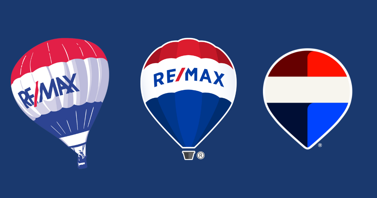
The evolution of the Re/Max brand
Experts suggest that the new look, while timely, is carefully designed to resonate with contemporary consumers.
“The rebrand speaks to the brand presence and what consumers are going to be seeing,” said Jenna Jacobson, assistant professor at Toronto Metropolitan University’s Ted Rogers School of Retail Management. “The vast majority may not be aware or concerned with the legal challenges.”
Jacobson emphasized the considerable research behind the refreshed design, noting its alignment with current visual trends such as sans-serif typography, flat icons and high-contrast visuals suitable for digital and social media platforms.
“It’s pretty obvious that it’s not a whole total rebrand that you wouldn’t recognize. It’s updating its existing rebranding to be more modern, to reflect current typographic and visual trends,” Jacobson explained. “These are things that look good on social and digital platforms. The rebrand does look good. It’s well-executed.”
Agents embrace refreshed identity
The updated branding effort follows closely after competitor Sutton Realty launched its own refreshed logo less than a year ago, aiming to reinvigorate its longstanding presence.
For Wheatcroft, the timing of Re/Max’s rebrand couldn’t be better, as his office was already considering its own refresh. He immediately welcomed the new design, noting the eagerness of agents to adopt it across marketing materials, signage, benches and posters.
“It’s a much fresher, modern take on what is quite an old logo,” he said. “It’s tricky to navigate. How do you take a brand that has 50 years of brand identity behind it that is extremely well-recognized but modernize it so it doesn’t look out of place in the marketplace and going forward? I think they’ve accomplished that.”
Rebrand alone don’t solve underlying challenges
Despite his enthusiasm, Wheatcroft emphasized that branding alone isn’t sufficient to address fundamental business concerns.
“I think there can sometimes be too much hype around a rebrand,” he said. “If you have a broken business, a rebrand is not going to fix it. We don’t have a broken business. I see this as an opportunity to continue to push forward.”
He highlighted that ultimately, success relies heavily on individual agents building their reputations alongside the company’s refreshed identity.
“I tell my team, ‘It’s about you, it’s how you build your brand on top of the Re/Max brand.’ That’s what this is all about.”


Anthony Marcusa is a contributing writer for REM.