


Welcome to your regular staging advice column designed exclusively for real estate professionals. Whether you’re grappling with how to enhance the visual appeal of your listings or seeking innovative strategies to captivate your target audience, you’ve come to the right place. This is your opportunity to pose any and all staging-related questions and receive expert advice, for free.
No query is too big or small — if it’s about elevating the look of your real estate, we want to hear it and we want to help! Email your questions to ninadoiron@isodesign.ca
As a real estate agent, you know that staging is a powerful tool for making a property appealing to potential buyers. However, there’s one aspect of staging that’s often underestimated: the impact of colour psychology. Colours can influence emotions, perceptions and even the overall appeal of a property. By strategically using colour in staging, you can help create an environment that resonates with buyers, showcasing the property in its best light.
Here, we’ll explore how colour psychology can play a role in staging and how you can leverage colour choices to enhance a home’s appeal. We’ll also offer tips on how to match colours with different property types, guide the buyer’s eye with accent colours and avoid common colour mistakes.
The basics of colour psychology
Colour psychology is the study of how colours influence human emotions and behaviours. Different colours evoke different feelings and associations, which can shape how buyers perceive a home. Here’s a quick rundown of common colour associations.
Blue: Calming and serene, blue is a colour that conveys trust and reliability. This makes it a popular choice for bedrooms and bathrooms, where buyers might be looking for a peaceful retreat.
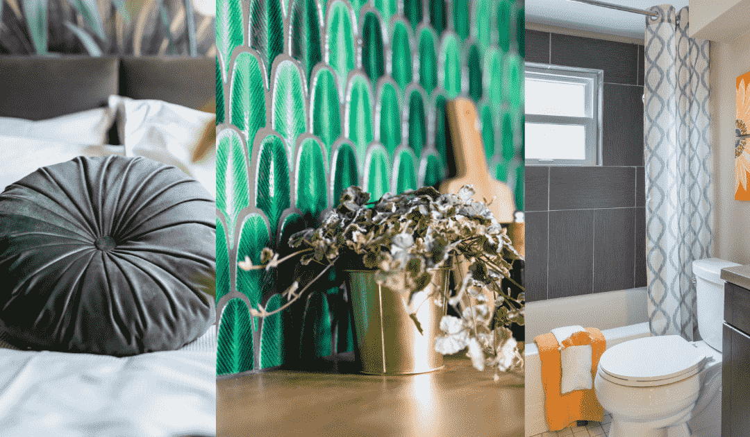
Green: Green symbolizes growth, nature and balance. It’s a refreshing colour that works well in living spaces and can give buyers a sense of rejuvenation and harmony.
Yellow: Often associated with warmth and happiness, yellow is a cheerful colour that can create a welcoming atmosphere. However, it’s best used as an accent colour, as too much yellow can be overwhelming.
Grey: Grey is versatile and modern, often associated with sophistication and elegance. It can make a space feel sleek and contemporary, which is why it’s commonly used as a neutral base in many rooms.
Red: A bold and energetic colour, red can create excitement and draw attention. However, it’s best used sparingly, as it can feel intense in large doses.
Understanding these basic colour associations can help you choose colours that evoke the right emotions and make buyers feel more connected to the property.
Choosing colours based on property type and market
When it comes to colour selection, one size doesn’t fit all. Your colour choices should vary based on the type of property and the target market. For example, a luxury property might benefit from deeper, richer tones like emerald green or navy blue, which convey sophistication. On the other hand, a starter home aimed at young buyers might do well with fresh, vibrant colours that evoke energy and optimism, such as soft blues, greens or light greys.
If the property is located in a coastal area, you might want to use colours that reflect the surrounding environment, like blues and sandy neutrals. Urban properties might benefit from sleek greys and bold accents. Understanding your market and tailoring colour schemes to fit it can give your listings a competitive edge.
Best colour choices for common spaces
The colour scheme for each room should match the room’s purpose. Here are some recommended colours for various spaces.
Living room: Neutral tones like beige or soft grey create a welcoming and versatile space that appeals to a broad range of buyers. Neutral colours allow potential buyers to imagine themselves in the space and personalize it in their minds.
Kitchen: White and light grey are popular choices for kitchens because they convey cleanliness and openness. For a bit of character, consider adding navy or sage green accents to cabinets or backsplashes.
Bedrooms: Soft blues or greens work well in bedrooms, as they promote relaxation and restfulness. Since the bedroom is often considered a sanctuary, avoid overly bright colours, which can disrupt the calm ambience.
How to use accent colours effectively
Accent colours are a great way to add interest to a room without overwhelming it with bold hues. These colours can be used in throw pillows, rugs, artwork or even on a single accent wall. For example, a pop of teal in the living room can bring life to an otherwise neutral palette, while a deep red throw blanket can add warmth and coziness to a bedroom.
Using accent colours strategically can guide the buyer’s eye and create focal points that highlight key features of the property. However, it’s important to balance accent colours with neutrals to avoid making the space feel too busy or cluttered.
What colours to avoid and why
While it might be tempting to go bold, remember that staging is about appealing to the broadest possible audience. Highly personalized colours, like neon shades or very dark hues, can turn off some buyers and make it harder for them to imagine themselves living in the space. For this reason, it’s generally best to stick to more universally appealing colours, especially on larger surfaces like walls.
If a home currently has very bold or unconventional colours, advise your clients to repaint before listing. A more neutral palette will help buyers focus on the home’s features rather than on specific design choices.
Practical tips to share with sellers
Here are a few tips you can share with your clients to help them enhance their home’s appeal through colour.
Repaint with neutrals: Suggest that clients repaint any bold or outdated colours with modern, neutral shades to create a blank canvas that appeals to most buyers.
Highlight key features with accent colours: Advise clients to use accent colours sparingly to highlight architectural features, like a fireplace or built-in bookshelves.
Focus on high-impact areas: If budget is limited, suggest prioritizing rooms that have the most impact on buyers, such as the living room, kitchen and primary bedroom.
Why work with a professional stager
While these tips offer a great starting point, partnering with a professional stager who understands colour psychology can enhance your listings even further.
Experienced stagers know how to choose colours that highlight each property’s unique features and appeal to buyers’ emotional triggers. They also have the resources and inventory needed to create a cohesive look that brings out the best in a property.
Using colour psychology in home staging is an effective way to create a more appealing and memorable experience for buyers. By understanding the basics of colour psychology, tailoring colours to the property and market and working with a professional stager, you can set the stage for a successful sale.
Got home staging questions for a future column? Submit them to ninadoiron@isodesign.ca


Award-winning Certified UltimateStager, redesigner and owner Nina Doiron is the principal at iSO Design. She provides an objective and experienced eye to attract more buyers and help sell for top dollar. She will also help you declutter and get organized. She says she will “inspire redesign ideas so that you’ll fall in love with your home again.” Call 416-993-0131.


Great article, Nina! Thank you.
Yes a client just submitted an offer $500,000 over asking on a condo listed for $499,900 just because of the colours!